shopify plus
I helped create an electric new brand for Shopify Plus, to pull them out of an identity crisis and establish their place in the market of eCommerce platforms.
The goal: Shopify Plus didn't only need to stand out against competitors — it needed to stand out against regular old Shopify! While their flagship service is a great and ubiquitous tool for small and medium businesses, Shopify Plus is an enterprise eCommerce platform for big companies like Staples, Heinz, Lindt, and many more. Unfortunately this wasn't always clear to potential users, who frequently confused the two services.
To that end, we collaborated with Shopify Plus to create a super bold and punchy brand featuring loud typography and an unapologetically neon color palette. With these foundations, we expanded into iconography, web and mobile pages, video and motion guidelines, and advertisements.
motion guidelines
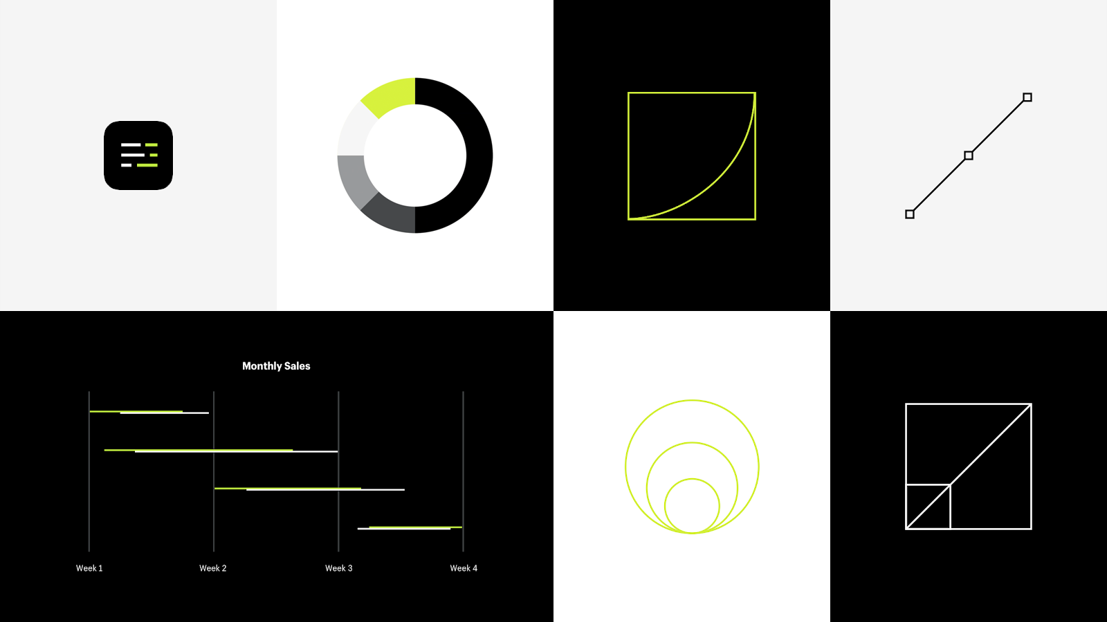
My greatest contribution to this project was writing the rules for how animation presented itself in the Shopify Plus brand. After joining this project and seeing the vibrant and energetic tone set by the color palette, I recognized an opportunity to reinforce that vibe through animation.

By isolating and exploring just the motion curves, we realized that this often-overlooked detail could fundamentally change the feel of Shopify Plus.
The curves I explored were nothing outrageous; I just took the familiar ease in/out/both curves and messed with their details. Simple adjustments created the illusion of speed without any difference in duration. Subtle stretching of the curve brought it into the uncanny valley where motion felt natural, yet tense and snappy at the same time.
At first, I tested curves by building a motion playground in Principle where I could experiment with different motion curves expressed within various UI elements. It wasn't anything like a typical prototype with content and a user flow — instead, it became a very precise tool to meet our specific need. After experimenting in that space, I was able to start implementing the beginnings of a motion system into full-page prototypes and video overlays.
Using an aggressive curve as the foundation for motion added an unmistakeable lighting-like energy to the brand. This small detail re-contextualized the neon green color as not just vibrant, but electric.
what else?
I also created the basic iconography set for the new brand! I'm a big fan of small victories, so I love working on icons.
The icons look standard at a glance, but certain ones were given an italic slant matching that of the Shopify Plus logo. That slant is a small but meaningful detail that supports the energetic vibe of the new brand, and we wanted to carry that detail through in unexpected ways.
conclusion
Shopify Plus' brand is one of the most fun projects I've had the pleasure to work on, and it allowed me to flex my prototyping skills in a unique way unlike anything I'd done before. It was a huge success, and I'm excited to bring these strategies to future projects down the road.