rochester regional health
Rochester Regional Health came to us with an idea — they wanted to utilize augmented reality in their hospital. Dhensel Dorji and I created and pitched a concept to reduce anxiety and confusion in hospitals using AR technology for effortless navigation.
core goals
CLARITY:
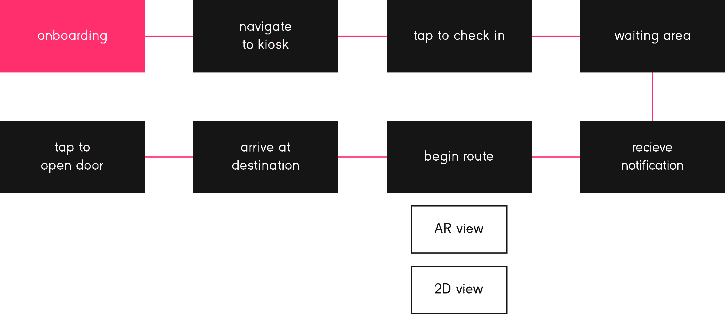
Reduce friction by streamlining check-in and guiding visitors throughout their entire experience.
STABILITY:
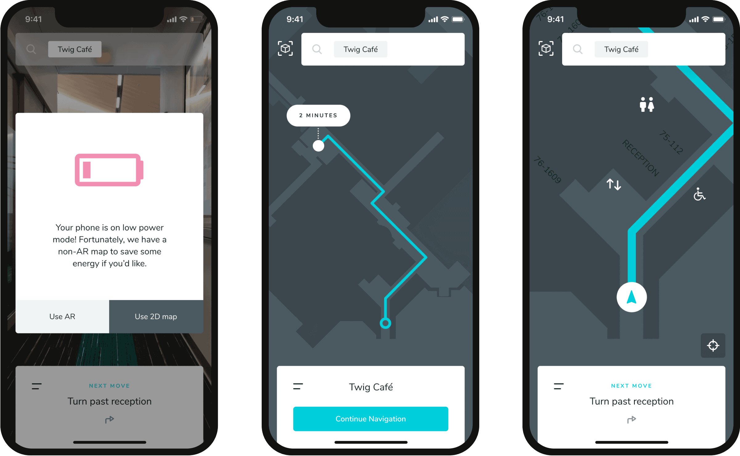
Design a stable user experience that responds gracefully to unexpected events like low battery or connection loss.
RESPECT:
Prioritize HIPPAA compliance — keep most information inaccessible while allowing visit-specific details to be synced to the user's phone.
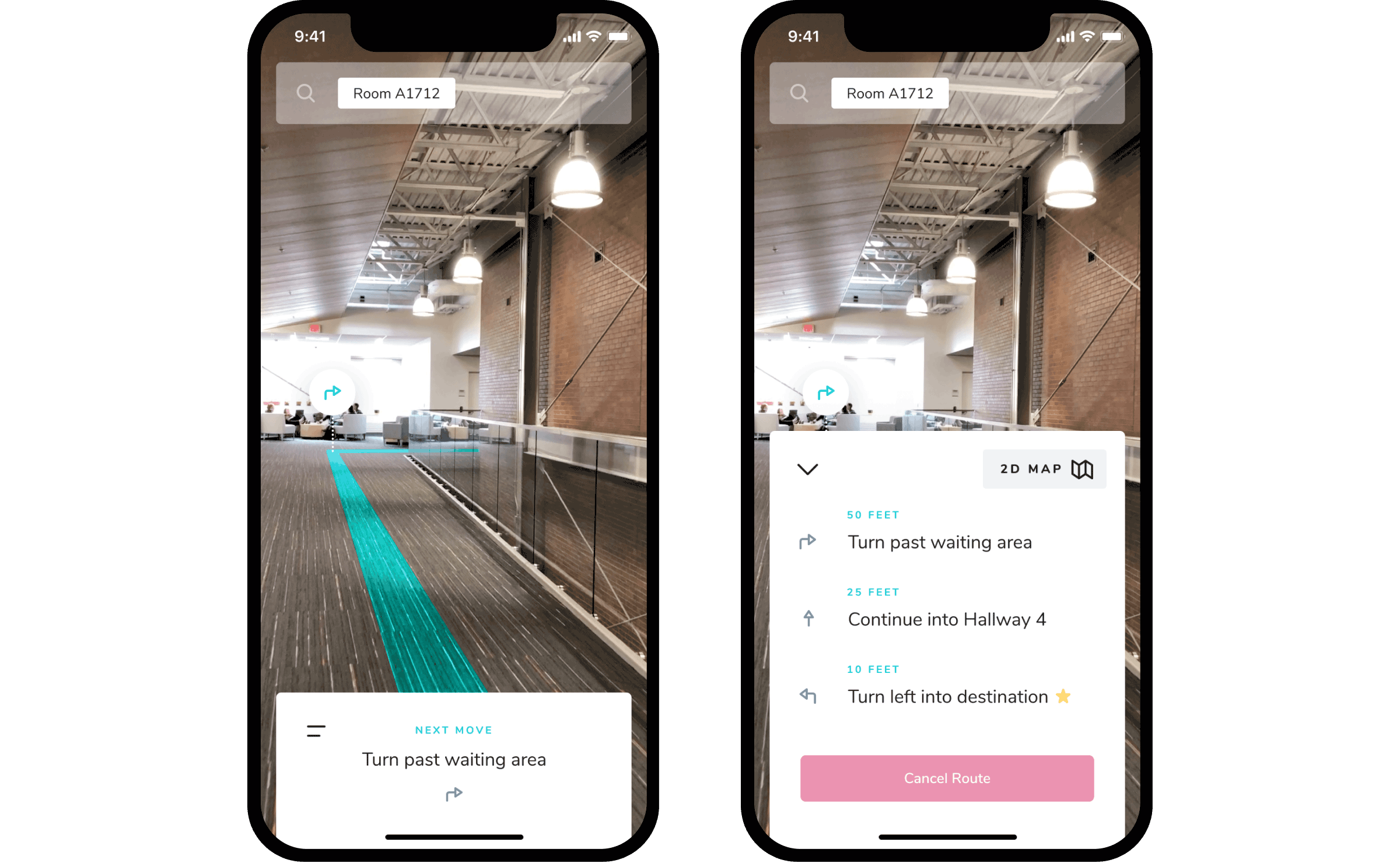
Smart Information
Because the visitor syncs the app to the hospital system open check-in, Wayfind knows why the visitor is at the hospital. This means the app can give them extremely specific guidance while removing unnecessary information.
visual style
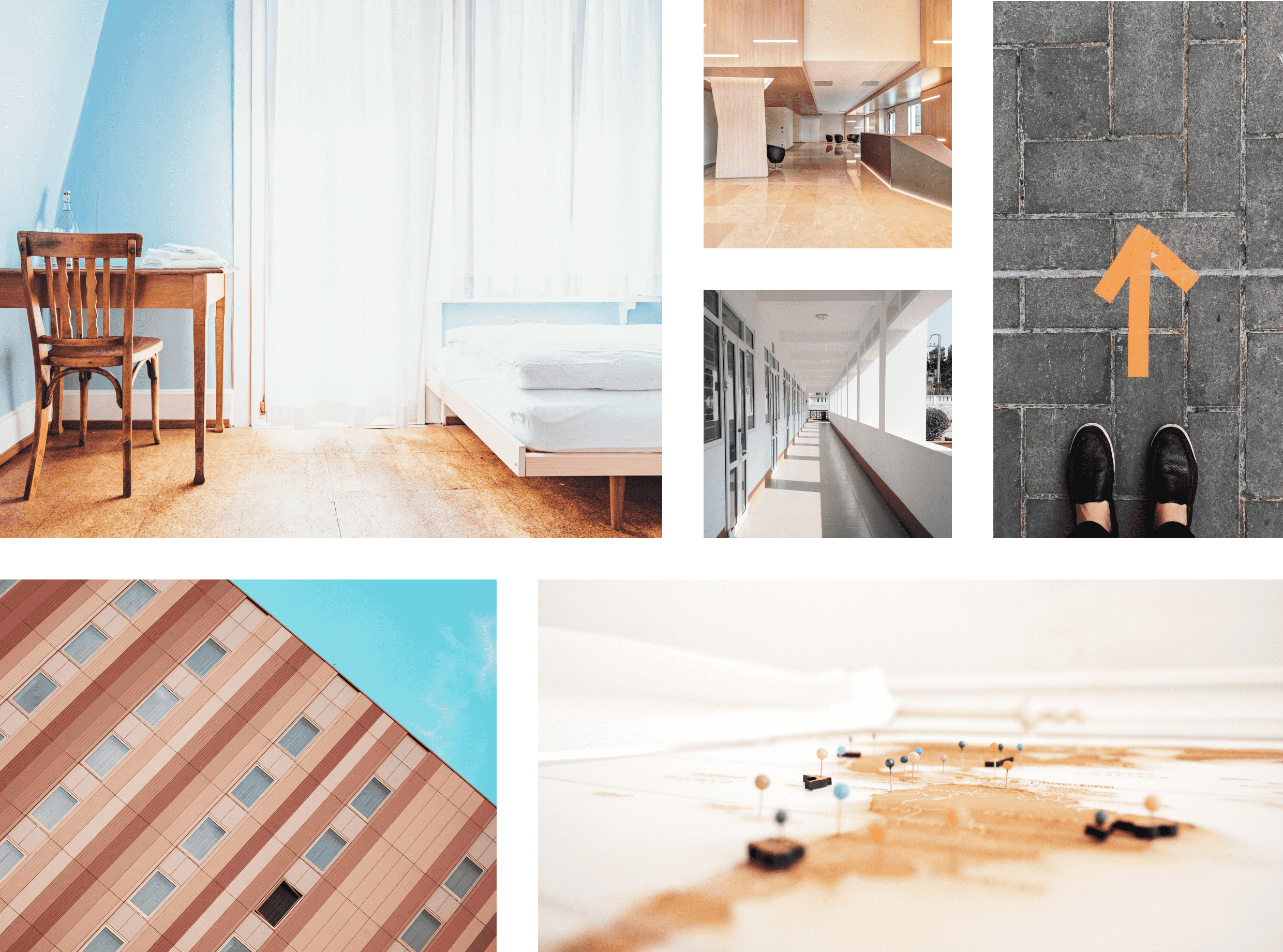
Our style is inspired by spaces that feel foreign, yet comfortable. We decided on this because a hospital will never feel truly relaxing, but we can look for inspiration in places that feel inviting despite their own unfamiliarity. The app's tone is intended to evoke gracious hotels, clean hallways, and peace of mind even in crisis. It is minimally colorful, spacious, and nurturing.
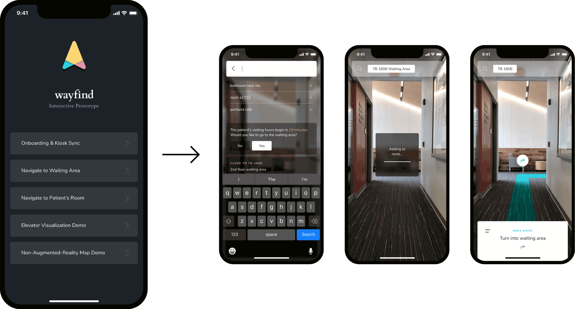
I wanted the ability to test the feel of this app on a real phone, so I built an animated prototype for each of the flows we designed.
To make the protype itself as easy-to-use as possible, I baked a navigation menu into the prototype as an introductory screen. From there, the user can jump into whichever flow they want, and can return to the menu at any point by tapping the phone with 3 fingers.
Creating an extremely thorough prototype like this meant that the work itself could be presented with almost no static screens — we were able to simply invite the client to jump straight into what felt like a nearly full-fidelity mobile experience.
conclusion
By reducing uncertainty in the experience of visiting a hospital, patients and family can find relief in what might otherwise have been an extremely stressful and emotionally demanding experience. Our goal was to use modern tech to improve a scary and confusing experience, and I think we succeeded.
credits
Visual design, interactive prototyping, and video editing by John Pascarella.
Storyboarding, motion tracking, and illustration by Dhensel Dorji.
Concept and user experience design by John Pascarella and Dhensel Dorji.