mycourses
myCourses is an online tool allowing users to access course materials, take exams, submit assignments, and more. It's an essential tool, but it suffers from such major design issues that it seems to create a new problem for every problem it solves.
As a student who was forced to use myCourses multiple times daily, I tried to imagine what this app could be if it truly addressed the genuine needs of its users.
primary goals
REBUILD THE ASSIGNMENT WORKFLOW:
Multiple features such as submission dropboxes and course content will combine into the single Homework section, allowing for easy assignment management.
FOSTER EASY AND PRODUCTIVE COMMUNICATION:
myCourses will introduce a new, more modern Slack-inspired communication tool. Students will be able to discuss with just classmates, classmates and professors, or individual peers.
REORGANIZE AND CONSOLIDATE:
Instead of forcing users to switch between pages, features will be optimized to be right where users need them, when they need them. All of the tools to start and finish work will be within arms reach of each other.

To determine what real-world users need from myCourses, I surveyed a group of nearly 20 students. Here's what I learned:
Roughly 80% of users access myCourses on a daily basis.
Many users requested features that myCourses already offers - even everyday users are not aware of some major features.
An overwhelming majority of users feel myCourses is poorly designed or difficult to use. Nobody described myCourses as "easy to use."
Users strongly prefer professors to use myCourses for consistency but many professors choose different, easier-to-use services.
Students complained that myCourses' mobile experience is difficult to navigate, and inexplicably lacking major features.
Most users feel that myCourses has a positive effect on college academic work.
Integration & intuition
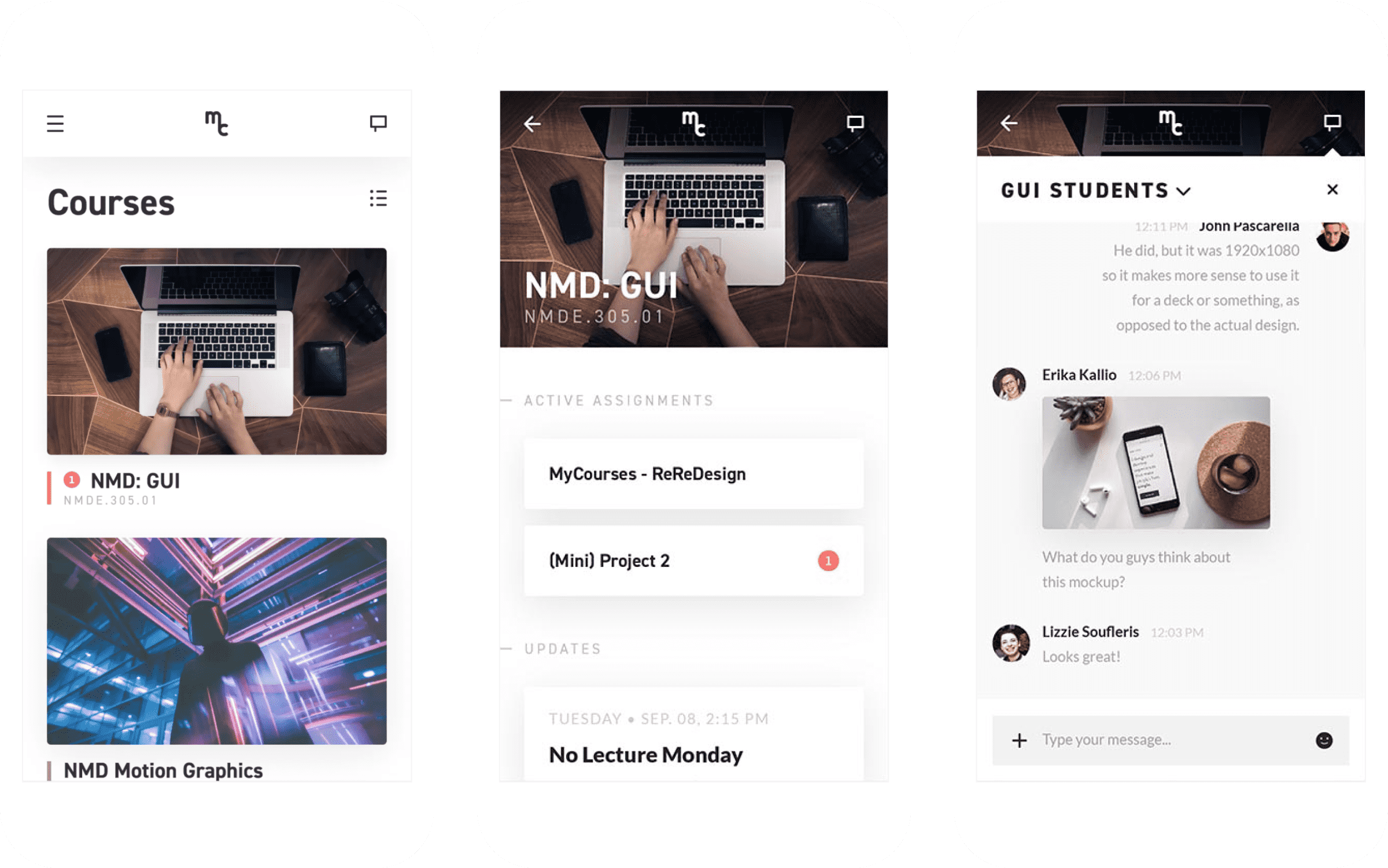
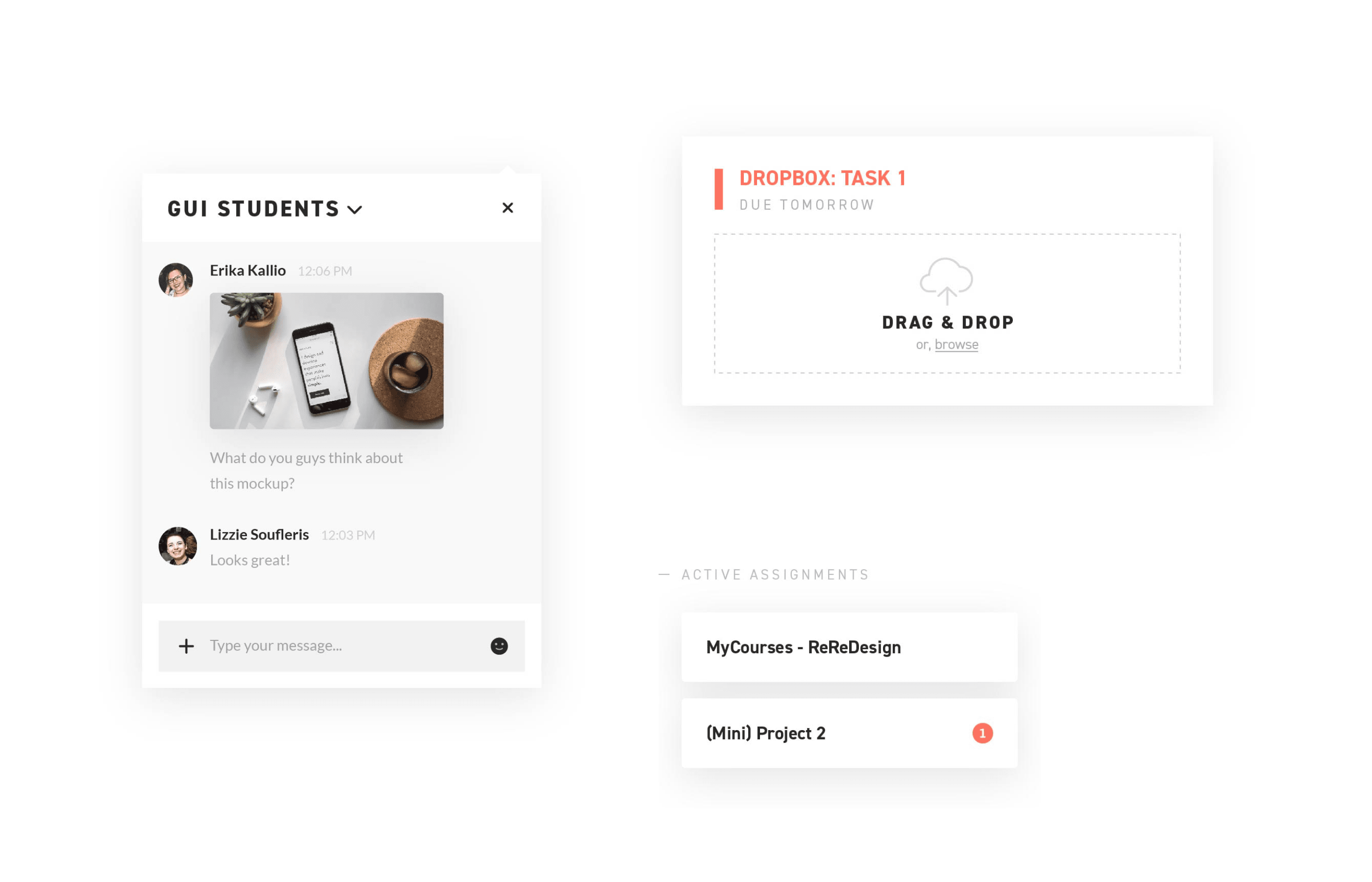
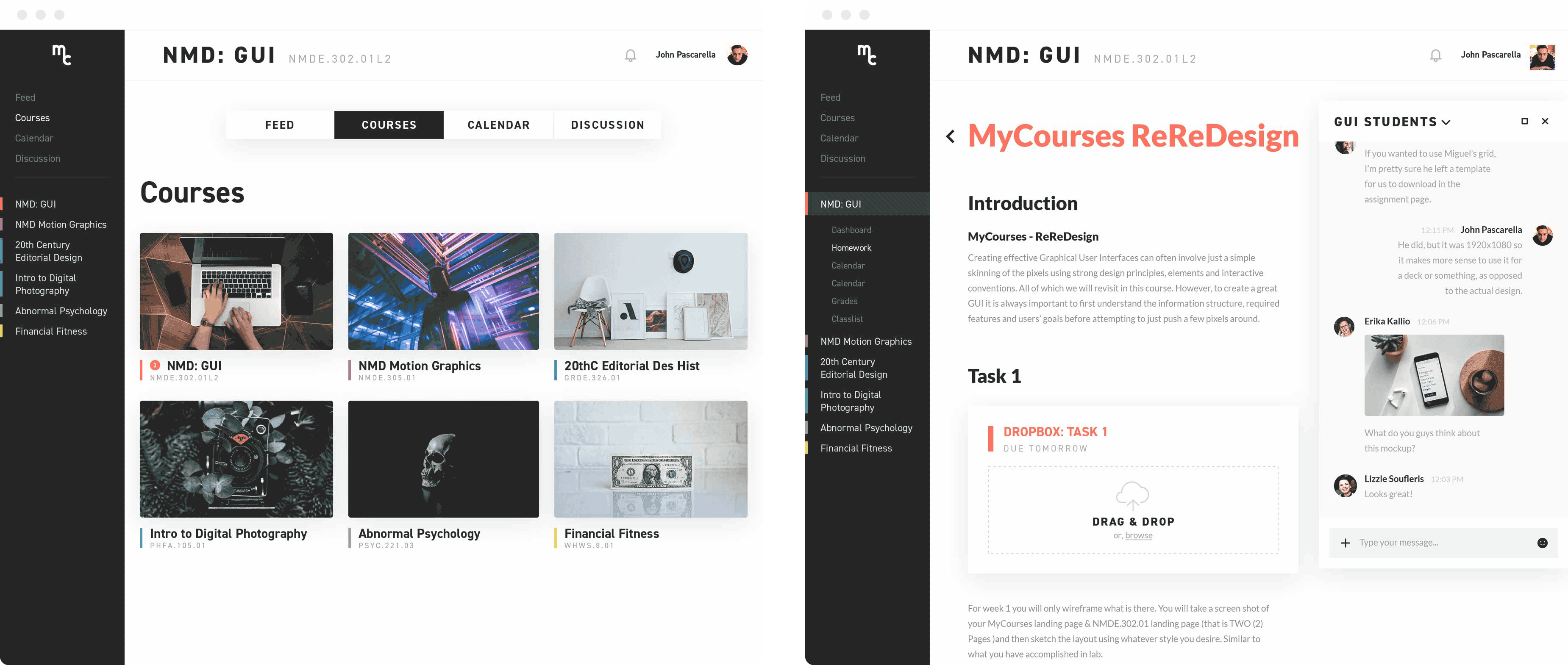
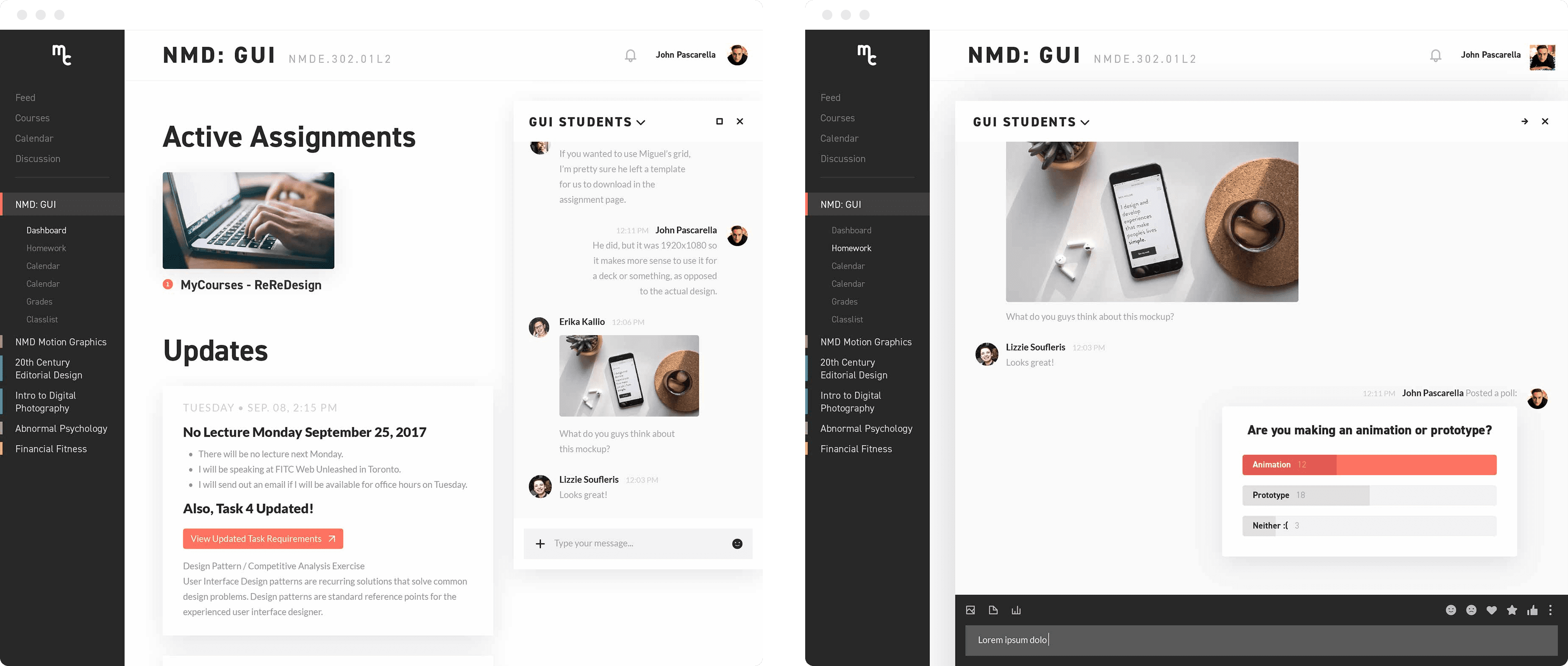
A productive myCourses user needs to be absolutely clear on the different assignments, the requirements, and where they can submit their completed work. They need everything in one place, within arms reach. On a course page, students can view all current assignments. While viewing an assignment, students can easily read instructions and submit work on the same page.
Communication
Many students value communication and collaboration, and want an easier way to discuss courses and assignments with classmates. Now, a Slack-inspired course discussion group is available on the side, and can be collapsed or expanded, giving students an easy place to reach out for questions or feedback. Tools such as polls allow easy and compact communication in large class-sized groups.
Motion design
While working on translating my desktop designs to a mobile interface, I was especially cautious of making the user flow easy to navigate. This is a lot of information to show on a tiny screen, and one of the hardest challenges to overcome was the difficulty of keeping wayfinding details in place without losing precious screen real estate needed by the actual content.
My solution was to put an emphasis on transitions and motion design. By seeing the pages move intuitively, I wanted to user to constantly be reminded about where they are in the larger web experience, what's sitting underneath an overlay, so on and so forth. Here's an example of how that looks in action:
How would these changes impact the student's day-to-day experience in myCourses?
By creating Slack-inspired discussion groups that are integrated directly into each course, students have an easy way to contact all of their classmates, particularly in situations where they don't personally know their peer
Everything needed to finish assignments is available in the same place. Assignment pages explain the homework, and submission dropboxes are directly in-line with the descriptions. No more juggling pages!
One of the users' biggest complaints was that myCourses mobile is useless. Now, students can communicate, check assignments, and even submit work just as easily on their phone as they would on their computer.