giant steps
GoGuardian is an industry leader in education technology. Facing a socially distanced school environment increasingly dependent on technology, GoGuardian wanted to build something new — a gamified education platform that could delight students, despite being legitimate educational software built on learning science.
“How do you build a game that is fun for students, while simultaneously convincing teachers that this is a serious tool?”
GoGuardian trusted our team to bring that vision into reality — an ambitious project that would come to be known as Giant Steps. For this work, I took on the role of design system manager.
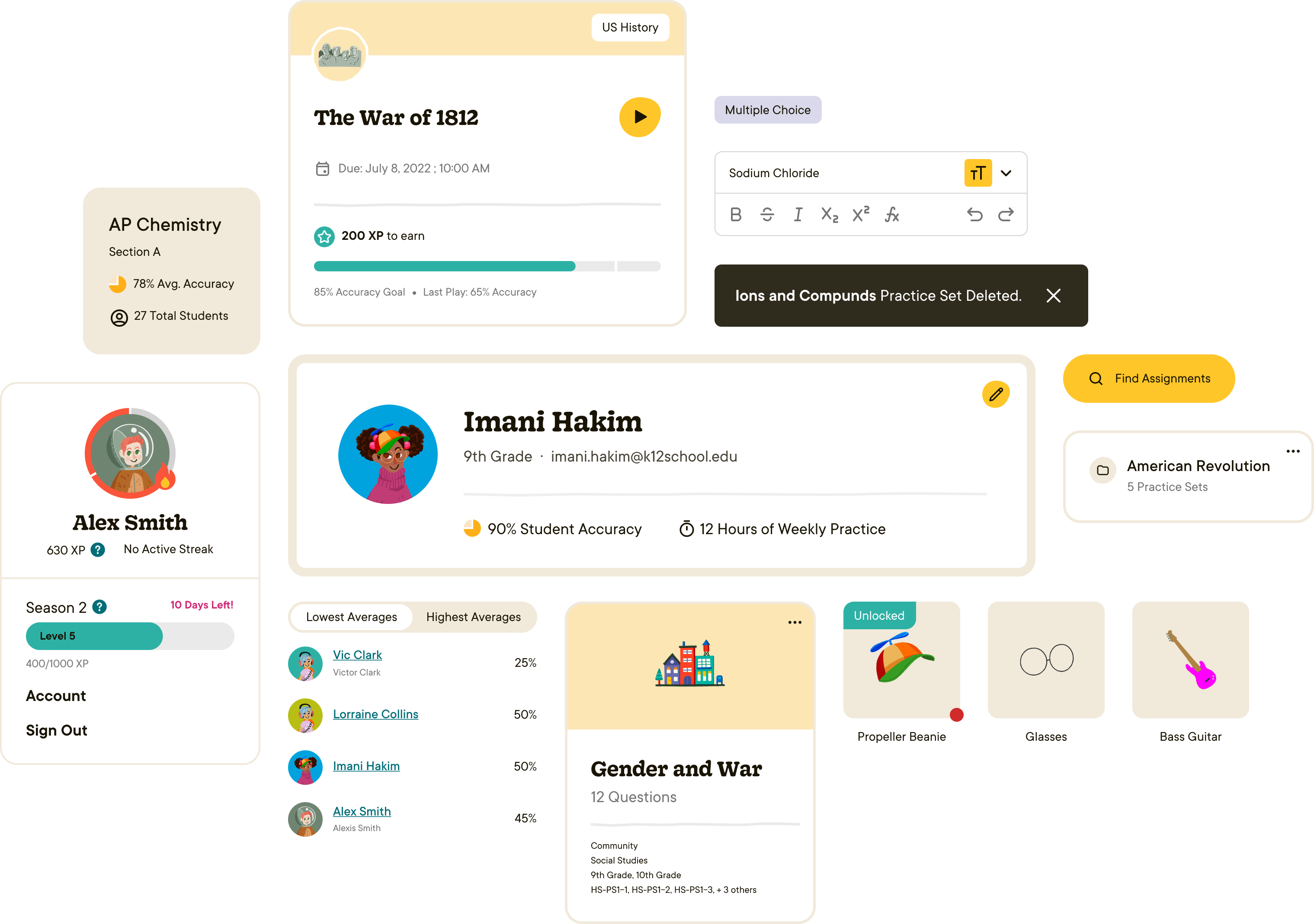
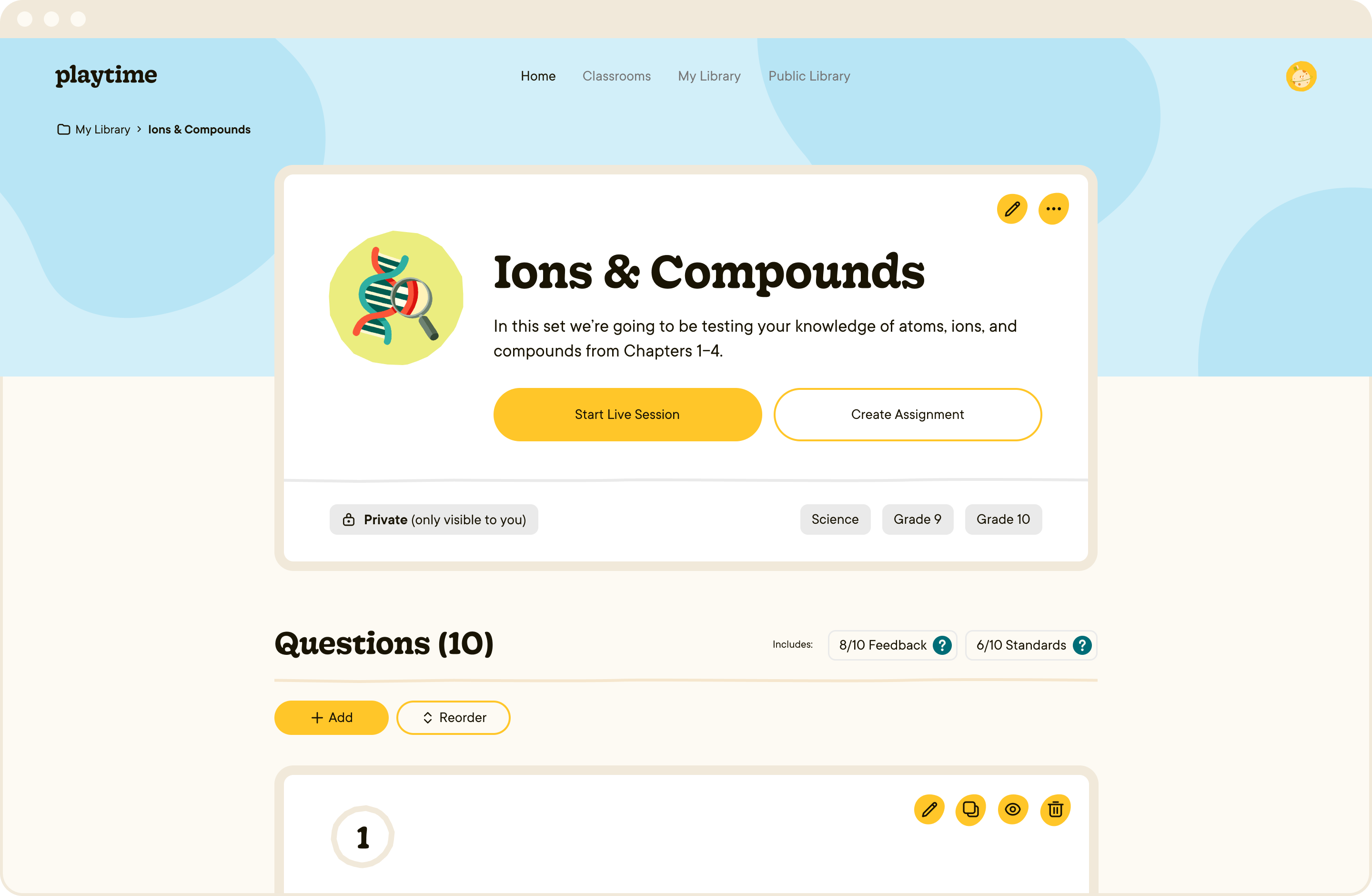
As the project's design system manager, I was tasked with personally enforcing a consistent functional and aesthetic ethos across the product. The bulk of this work took the form of recieving draft screens from the design team, and building components for each element to the standard of quality expected from a library. Then, I rebuilt each screen to deliverable accuracy using those components. This process ensured every element of every screen was accounted for in the design system, and allowed the rest of the design team to move quickly through screens with a focus on general function and beauty rather than to-the-pixel fidelity.
This workflow required me to maintain close communication with the design team — not only to ensure their intent was reflected in the final components, even through the consistency and accessibility changes I made, but also to ensure I was giving them the building blocks they needed for future screens.
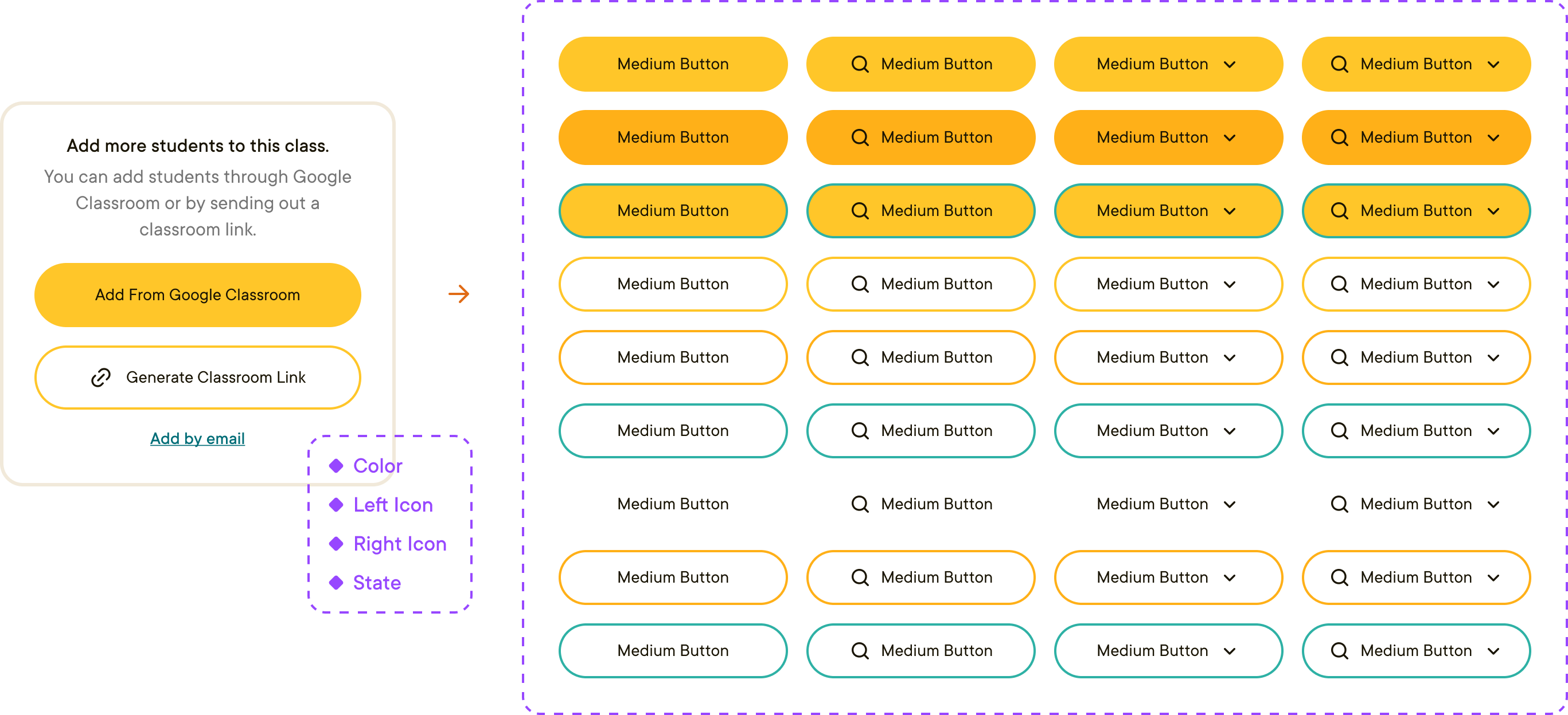
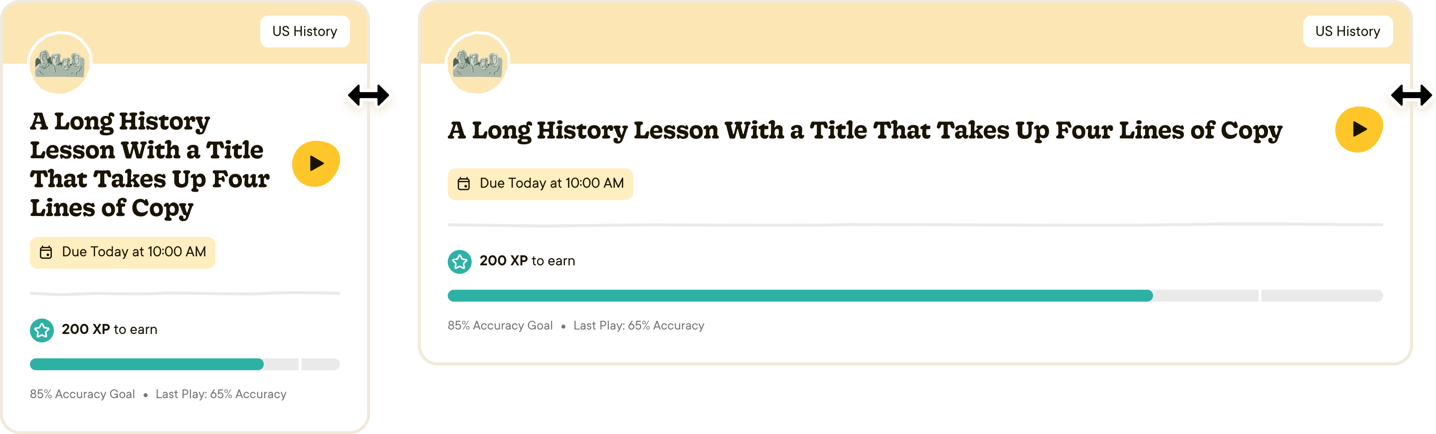
An important aspect of my work was making sure the components themselves functioned exactly as they would in the final product — or, as close as possible with Figma's current Auto Layout features. Setting up the library like this left the development team with minimal questions about things like how cards handle multiple lines of copy, or how they scale in between breakpoints.
Having comprehensive knowledge of Auto Layout really helped make this possible! When static designs couldn't get the job done, I threw together animated prototypes to demonstrate more complicated interactions in motion.
Once the design phase of the project was complete, my role transitioned into VQA. As the sole remaining designer, I was singularly responsible for cross-checking every element from the development team, verifying everything from visual fidelity to responsive behavior and copy accuracy. Additionally, I had to be available anytime to answer design questions from the developers as they built out new components and screens.
This work also involved creating lots of instructional content for the developers. Since they're not all well-versed in Figma, it was important for me to not just build the components correctly, but help illustrate some of the rules behind how they were built. This way, developers could save time and improve consistency by copying shared characteristics between components, just as we did in the design phase.
As someone who strongly values attention to detail in design, this kind of role was perfect for me! I loved being an honorary member of the dev team, and our super close collaboration allowed us to move quickly through tickets and avoid confusion.
conclusion
Working on Giant Steps was genuinely fulfilling for me. I love working in education software, and the design system management role allowed me to really capitalize on my organizational skills in ways I couldn't in more traditional design positions. I learned a lot about the development process during my time with the dev team, and I hope to continue finding work like this in the future!
See Giant Steps for yourself →
Article: Giant Steps — a New Gamified Digital Learning Experience — Launched to Boost Student Collaboration and Independent Practice Inside Classrooms and Beyond
Instrument's case study: Giant Steps