an electric new brand for shopify plus
MY ROLE
Motion design
Iconography
CONTEXT
Client work with Instrument
shopify plus got a shiny new brand, to pull them out of an identity crisis and establish their place in the market of eCommerce platforms.
Shopify Plus needed to stand out against both competitors and regular-old Shopify. While their flagship service is a great and ubiquitous tool for small and medium businesses, Shopify Plus is an enterprise eCommerce platform for big companies like Staples, Heinz, Lindt, and many more. Unfortunately, this wasn't always clear to potential users, who frequently confused the two services.
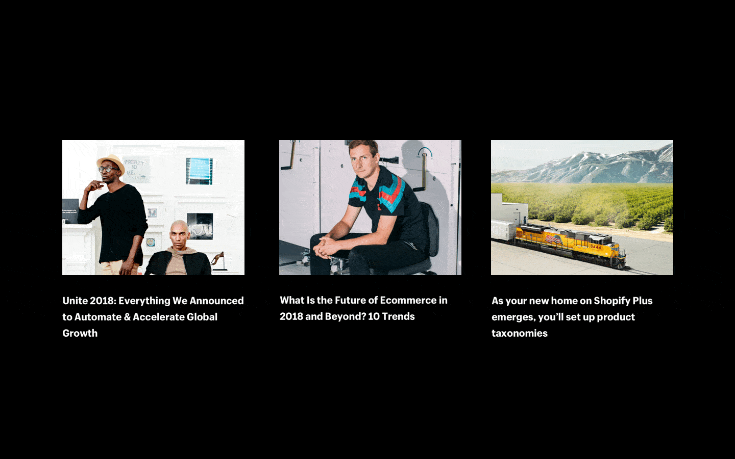
Our team at Instrument collaborated with Shopify Plus to create a bold and punchy brand featuring loud typography and an unapologetically neon color palette. With these foundations, we expanded into iconography, web and mobile pages, video and motion guidelines, and marketing material.
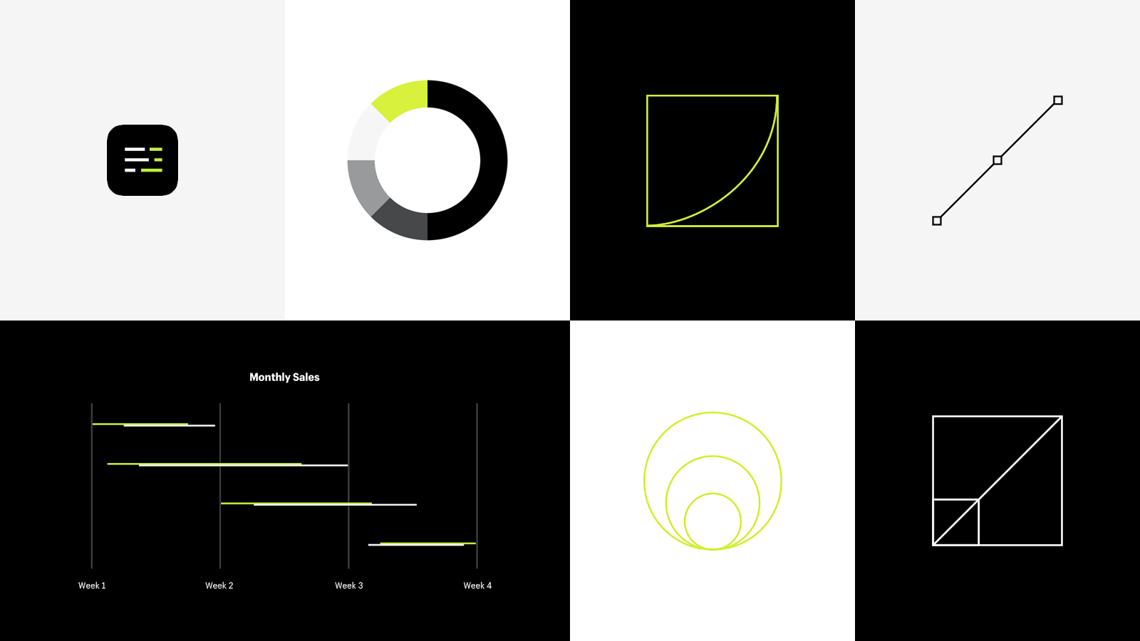
My primary contribution to this project was writing the motion guidelines for the Shopify Plus brand. Seeing the vibrant and energetic tone set by the color palette, I recognized an opportunity to reinforce that vibe through animation.
By isolating and exploring just the motion curves, we realized that this often-overlooked detail could fundamentally change the feel of Shopify Plus.

My explorations were nothing outrageous; I just took the familiar cubic bezier and messed with the details. Simple adjustments created the illusion of speed without any difference in duration. Subtle stretching of the curve brought it into the uncanny valley where motion felt natural, yet tense and snappy at the same time.
At first, I tested curves by building a motion playground in Principle where I could experiment with different motion curves expressed within various UI elements. After experimenting in that space, I was able to start implementing the beginnings of a motion system into full-page prototypes and video overlays.
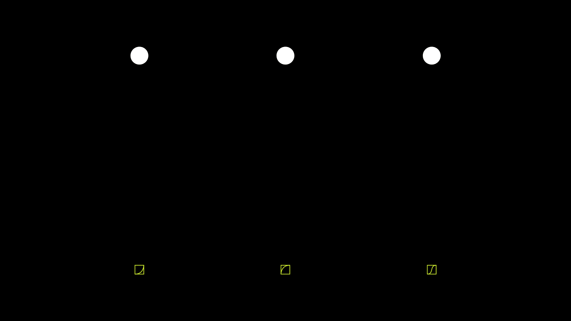
Using an aggressive curve as the foundation for motion added an unmistakeable lightning-like energy to the brand. This small detail re-contextualized the neon green color as not just vibrant, but electric.
I also illustrated the basic iconography set for the new brand. The icons look standard at a glance, but certain ones were given an italic slant matching that of the Shopify Plus logo. That slant is a subtle put powerful way to make the energetic vibe feel woven into the fabric of everything the customer sees.
This sharp new identity served Shopify Plus for years, before its eventual re-absorption under the unified Shopify name.
As a product designer, I've spent relatively little time working on brand projects. This change of pace for me was a blast, and I'll always be open to more like it in the future.