equitable education with lumen one
MY ROLE
Product design
Queer representation
Accessibility advocacy
CONTEXT
Client work with Instrument
Lumen Learning is a disruptor in the world of online education, and they needed to combine their multiple disparate products into a single exemplar, Lumen One. At the forefront of their priorities was centering equity, and they opened with a mountain of a benchmark for success:
“our ultimate outcome is to eliminate race and economic status as predictors of success.”
Along the way to this ambitious endgame, there were challenging factors to work around — the entire product had to be designed within an iFrame that could be gracefully nested inside multiple different Learning Management Systems.
The following are a few particularly notable areas of the final product in which I played a larger ownership role.
names matter
It's extremely important to be referred to correctly. Unfortunately this can be an uphill battle for students. Universities typically make it worse, through policies such as forcing trans students use their legal names on IDs and academic software.
How can a professor consistently use a student's correct name and pronouns when constantly being presented with wrong information?
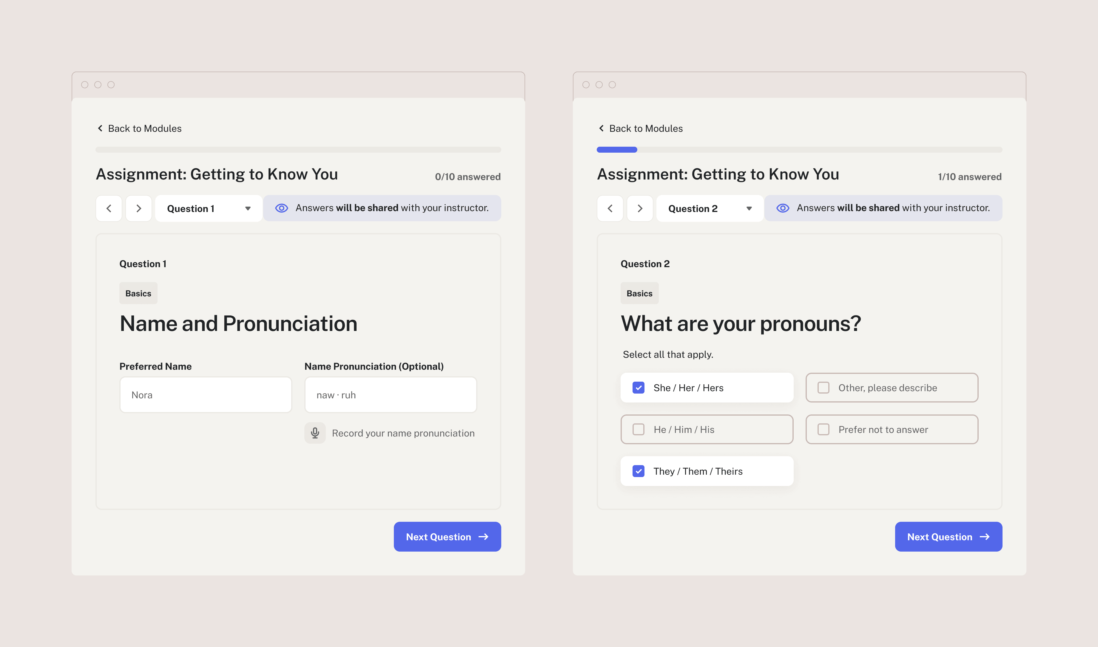
Our first opportunity came in a "Getting to Know You" questionnaire. Originally, this screen just asked for the student's legal first name and last names, despite that information existing in the university's database. By removing unnecessary fields and using more specific copy, we clearly encouraged students to write in the name they actually use, with pronunciation.
I advocated for an ever-present visibility alert to ensure that students can answer comfortably, knowing who can see their responses.
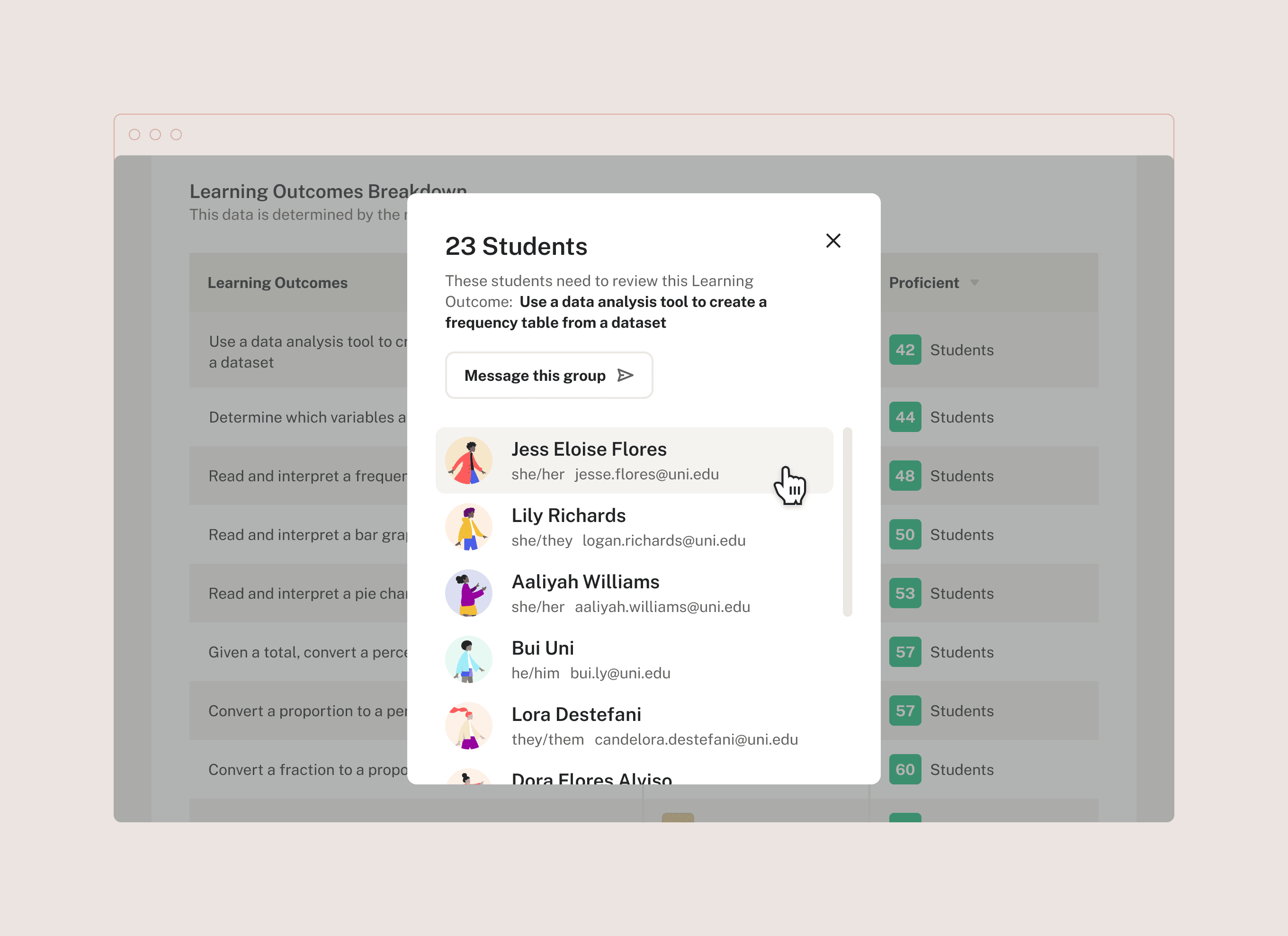
These considerations persisted into the students' displayed names throughout the UI. The client's request was to show legal names first, and bury preferred names in the student's profile page. I felt strongly this wasn't the right solution.
As the only genderqueer person on the team, I was able to offer a unique perspective to this conversation.
I pressed Lumen — in what situation should an instructor ever intentionally ignore a student's preferred name? The answer, of course, is never.
I won the client's approval on the design below. Every student's display name is their preferred first name, combined with their university-provided last name. Any time their name is visible, so are their pronouns. Because of this, our design intentionally makes it as difficult as possible for an instructor to accidentally misgender a student or use the wrong name.
The design acts as a forcing function, placing inclusion and respect into the foundation of the product.
accessibility first
All products should prioritize accessibility, but in education, the stakes are even higher than usual — messing this up would gatekeep students from their own education. I found myself often taking the role of accessibility advocate on this project, and had personal ownership over ensuring that experiences like our video lessons were as accessible and inclusive as possible.
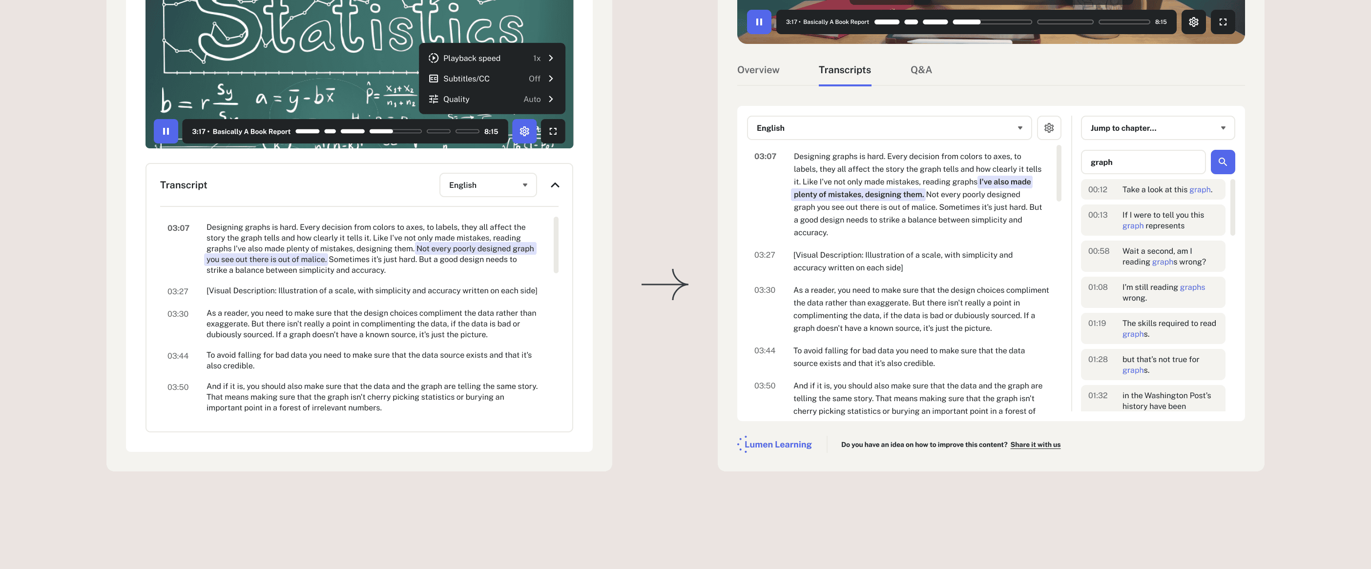
After much research, I designed an example for a best-in-class accessible video lesson. It included fully searchable transcripts with language support, active highlighting for the words being currently spoken, and a 1:1 connection with the closed captioning and video chapters.
However, we had to also consider the size of Lumen's development team, and what was possible within the MVP's scope. We knew they wouldn't be able to immediately implement something this robust, but there had to be something that allowed disabled students equal access to the learning material. To solve this problem, I also designed a simpler, temporary transcript that could be scaled up when Lumen has the resources to do so.
It was incredibly rewarding to work with a client that genuinely prioritizes equity & inclusion, rather than treating it as an afterthought. As a queer person, I'm especially proud to have provided representation that will improve the educational experience for countless queer students.
It will take time to know for sure if Lumen Learning accomplishes their goal — eliminating race & economic status as predictors of success for their users. But with robust user research, diverse internal and external voices, and a genuine desire for learning and growth, I have confidence that our work with Lumen will go on to be profoundly successful.